Financial Tool
A Straightforward Content Strategy for an Investor Tool
In 2015, I worked with a financial organization that regulates financial professionals and their firms and educates investors to help protect them from fraud. I designed a content strategy to improve the accessibility of information and help the users better understand the information that was available in the tool.
Lead UX / UI Designer & Content Strategist
As the Lead UX Designer, I conducted a content audit to understand the content available inside the current online tool and devised a content strategy for displaying more information in the tool instead of in a PDF. I produced wireframes and design mockups and worked closely with the client’s internal development team to implement the proposed changes on time and on budget.
I also oversaw the visual design process for the creation of a site-wide icon set as part of this project by coordinating designers, providing art direction, and supporting production needs.
The Challenge
The financial agency was scrutinized because users felt they weren’t getting the information they were expecting from the tool. The client was having difficulties explaining what information the application could legally provide to its users.
The Vision
Adopt a responsive design for the tool, extract more information into the tool from the PDFs, and create an approachable content strategy to set expectations for users.
The Impact
The tool gets more traffic than the rest of the agency’s website put together. The improvements increased quality search traffic by 150% while lowering the bounce rate by 25%. The project also included an SEO effort leading to a 50% increase in search traffic.
UX Design & Content
Making Data-Driven Decisions
Improvements to the financial tool were prioritized based on the analysis of usability testing and analytics. The main updates included reorganizing the information architecture, creating clear user pathways, and focusing a content strategy on the information the tool can display.
Clear User Pathways
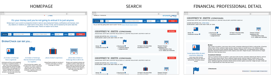
I reorganized the information architecture to enhance findability and searchability of information, and introduced clean user pathways to move users through the tool from inputting a search term to browsing search results to accessing the information for an individual or firm that the user ultimately needed.
An Approachable Content Strategy
After conducting a content audit and understanding the nuances of the content, I focused the content strategy around telling a more transparent story about the information a user can expect from the tool and the information a user cannot expect from the tool. I wanted to clearly set expectations for the user and explain why the user can only receive certain information from the tool. This content strategy should alleviate some of the negative feedback the financial organization has received about this tool.
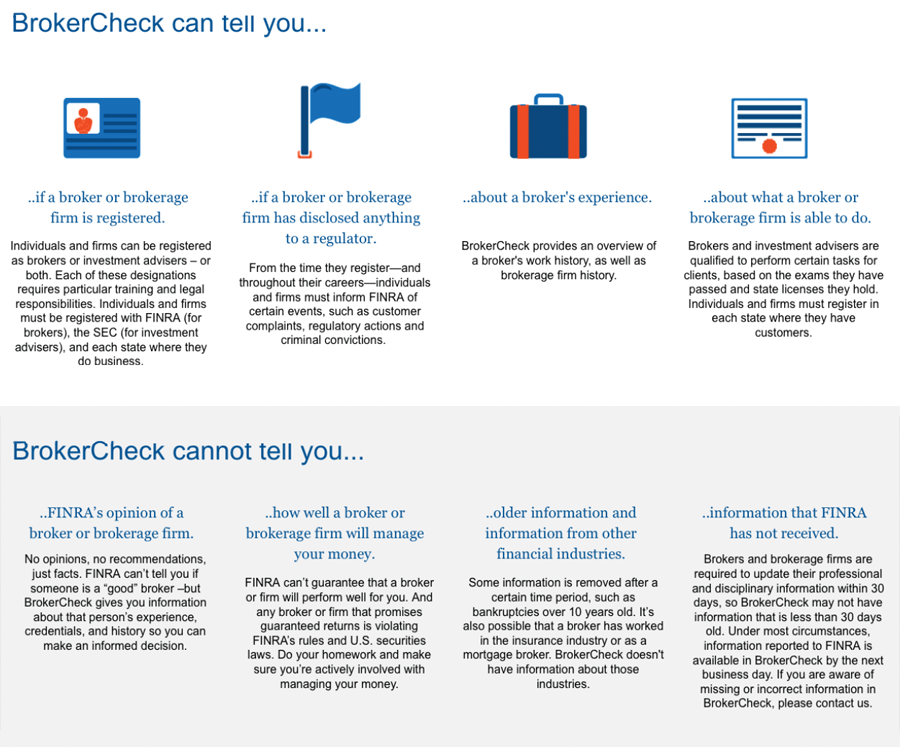
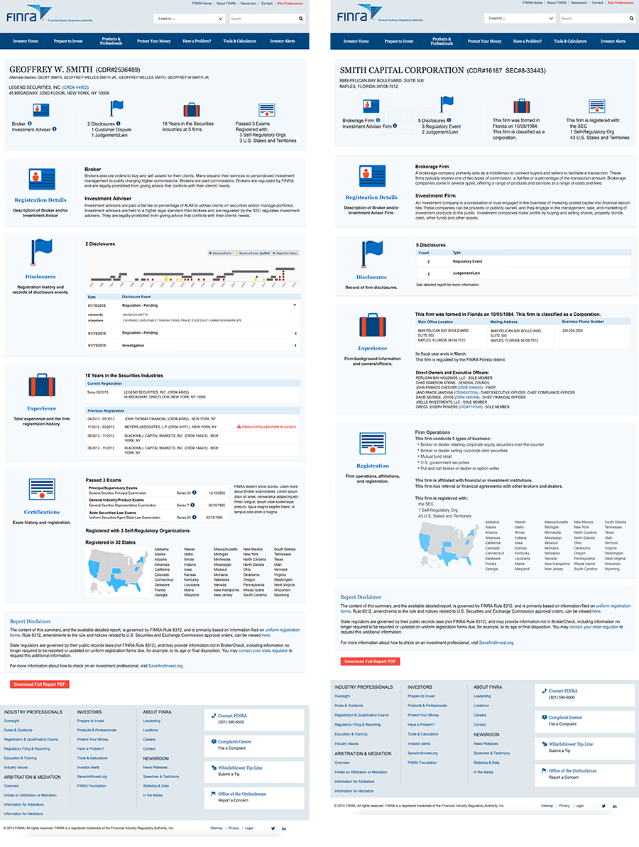
To make the information more consistent and approachable, we defined four main categories of information and used plain language instead of financial jargon to explain the categories. The homepage defines four main categories of information and sets a user’s expectations about what they can learn from the tool. The search page displays the same for main categories for each financial professional and gives an overview of information for each category. The detail pages also display the same overview for continuity and provide more details within each of the four main categories.
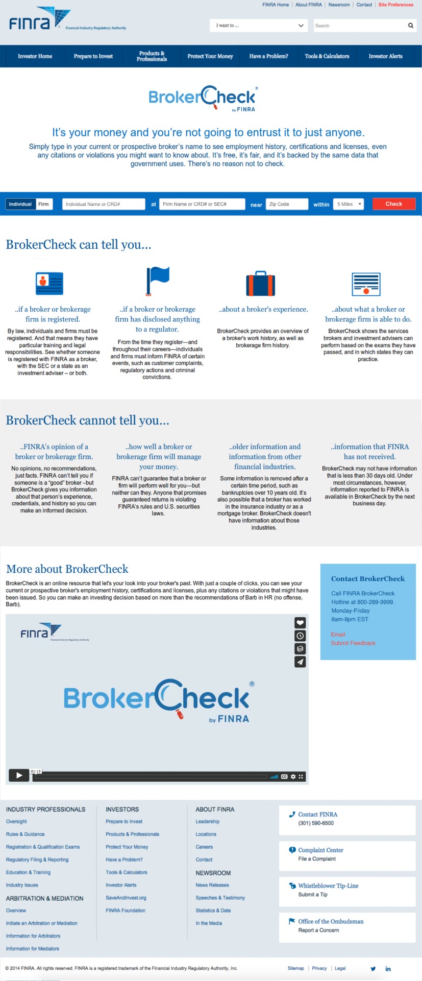
Part of making the content more approachable is making it more accessible too. By importing the information contained in the print PDF reports, and displaying it on the detail pages, users can access the information they need without downloading the large PDF file.
UI Design
Designing a Tool During a Website Redesign
The updates to this tool were being completed while a much larger project to redesign the organization’s website was being implemented.
A New Brand for the Tool
The financial organization finished working with an agency to brand and market this tool. I lead the UI design and creation of this set of icons for this tool which are consistent with the icon set displayed throughout the financial organization’s website.
![]()
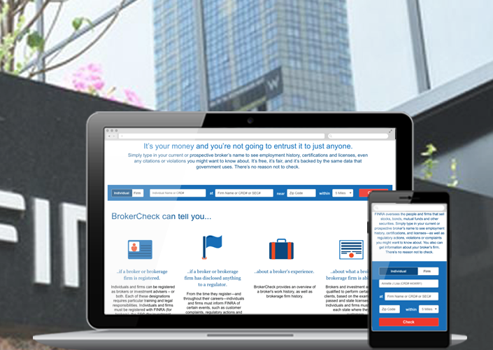
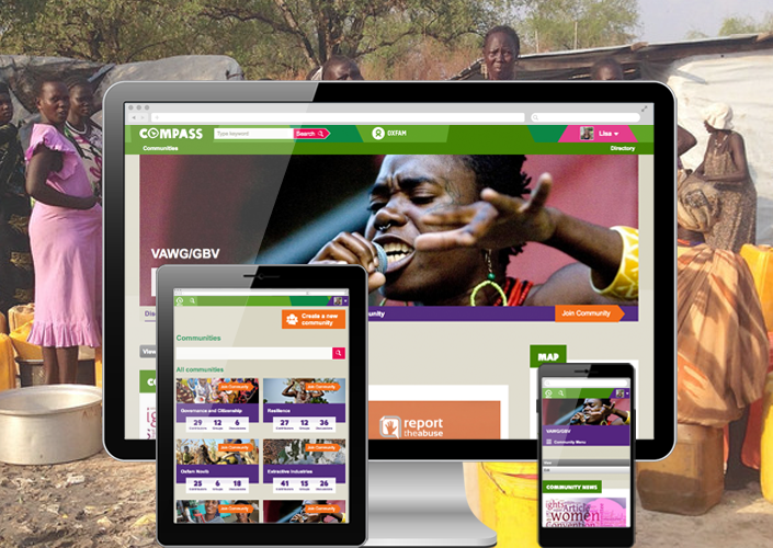
A Fully Responsive Design
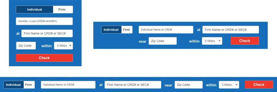
To integrate with the financial organization’s new responsive website, this tool also needed to be responsive. I purposefully placed form elements in layouts for display on various size screens so mobile users can easily use all aspects of this tool to find information about financial professionals.
Recent Portfolios

Quicker Report Writing and Review for Public Safety
Integrated Websites for a Public School District
A Collaborative Workspace for an International Nonprofit