Nonprofit Intranet & Community Platform
A Collaborative Workspace for an International Nonprofit
During this two-year project, I worked with an international charitable organization to understand their requirements for a global collaboration platform that will help them become more efficient and effective in their work to alleviate global poverty and aid after natural disasters.
UX / UI Designer & Strategic Partner
My role on this project grew as the project did; from a design consultant advocating for the users to a strategic partner helping to define the vision for the platform.
I was a valued part of the scrum team. I worked closely with the technical architects to define requirements and simplify workflows, and collaborated with the front-end developer to create a design system that was flexible, scalable, and responsive.
The Challenge
The main challenge for this project was to discover what the client really needed and to lead them to the best solution for their overall IT goals which weren’t necessarily what was specified in the scope of work.
The Vision
Develop a platform that will grow and scale over time where personnel can collaborate and share useful resources and on-the-ground insights. It will serve as a “digital water cooler” for people working half a world away from each other.
The Impact
We’ve rolled out three major evolutions of the platform, supported the client as they’ve onboarded their personnel to the new platform, started a major migration, and prioritized our roadmap for future phases.
The Discovery
Starting Small, Dreaming Big
Phase one consisted of implementing an out-of-the-box solution, built on Drupal Commons, as a proof of concept for community collaboration. A single working group was invited to use the community and provide feedback.
With a positive review from the collaborators, we began customizing the proof of concept to incorporate multiple communities. We also collected more feedback and requests for feature upgrades and tool integrations which actually would work better in Drupal not Drupal Commons.
A Change of Pace to a Digital Workplace
The team listened carefully and asked questions to learn everything we could about the client’s internal systems and what they thought the goals of this project were. We uncovered internal complexities, finally understanding that each regional organization within the confederation had their own IT with their own technical solutions for knowledge storage and sharing.
Our team determined the need for a more integrated global solution for knowledge storage, sharing, and collaboration.
Create a virtual hallway: one place for the client’s 10,000 staff to intentionally and serendipitously collaborate to make their work more effective.
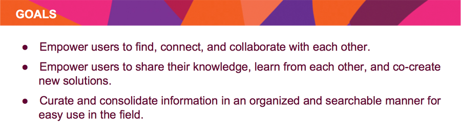
Formally Defining Goals
With the growing complexity of this project, we formally defined and prioritized goals for this project.
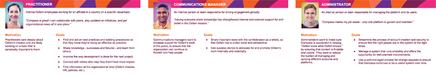
Understanding the Users
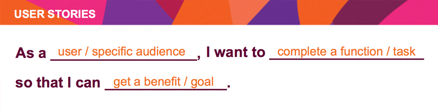
With help from the client, we defined the users for this system and created personas. Each persona represents a group of personnel within the client’s organization.
These personas have become the basis for developing the “Big Picture” strategy and for writing all user stories that get developed.
UX Design
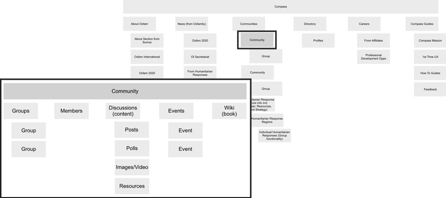
Collaboration, Curation, and Connection
This digital workspace will be the one-stop-shop for accessing all of the client’s knowledge and third party tools.
Individuals can create content in groups and communities. They can collaborate and curate by creating and by commenting on posts, editing wikis, and share relevant information. Personnel within the client’s organization can also access their directory to find and connect with anyone from any of their regional organizations.
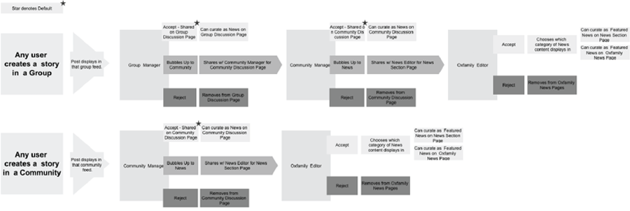
Managing Users and Content Workflows
Customized roles and permissions were set up to give specific users access to certain features depending on their position within the organization. I created workflows to allow for checks and balances within groups and communities using the platform.
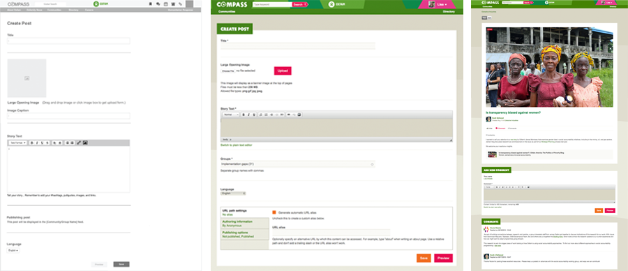
The Authoring Experience IS the User Experience
In order to give the users a seamless user experience, I worked with a front-end developer to designed and themed some of the pages that are usually only seen on the back-end of the CMS, like the “Create Content” and “Edit Content” pages, as though they were part of the front-end experience. We also added more descriptive labels and help text to each of these pages to provide clear pathways for users to complete their tasks simply and easily.
Navigating Technology Integrations
This Drupal 7 platform features integrations with the client’s identity provider and single-sign-on system as well as other tools such as Box for document storage, and Skype for real-time communication. The platform has the potential for more integrations in the future.
Must-haves for Migration
The migration was not just a technical challenge, it was also a human one. It required significant coordination with multiple regional client organizations and departments to help the client adopt this new platform.
I mapped content types, rearranged taxonomies (combining some, adding to some, and deprecating others), and set messages in the old system so group managers could align their groups with the new communities and set expectations within their groups for moving to the new system.
UI Design
A Fully Branded Experience
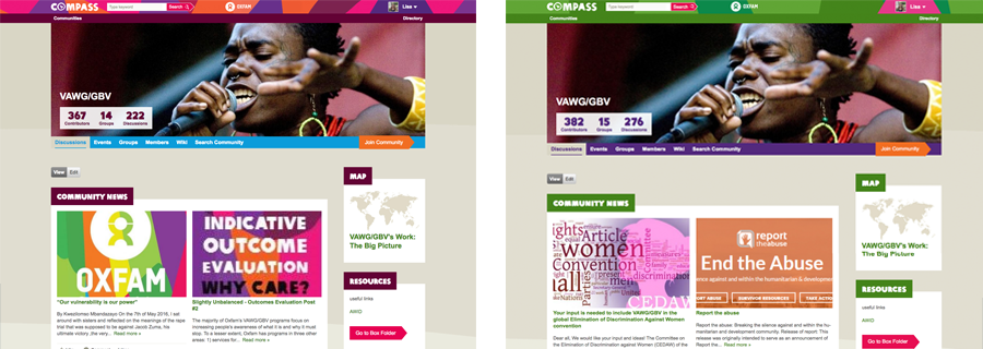
The client has an extensive 80+ page style guide for their external websites which I used for an overall brand perspective. Included in this style guide were a few options for color palettes. The primary green color palette is typically used for the client’s external websites and the blue color palette is used for their partner websites. I chose to use the burgundy color pallet for this internal system.
We implemented the burgundy color palette into this modular design knowing that at some point it may need to be changed. And it did. As the system grew, more client teams needed to give input and the client’s internal brand director decided this system should use the primary green color palette so we made the changes. And because of the atomic design principles used with PatternLab, it took only a couple hours to switch out the color pallete.
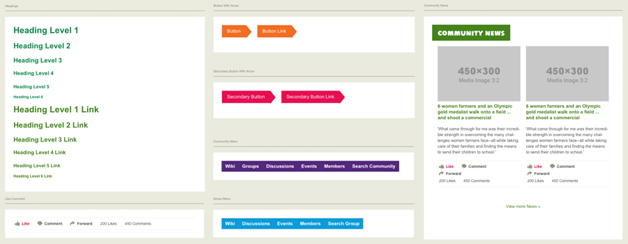
Using Atomic Design Principles
The user interface was designed to be flexible enough to scale and grow as the platform does. Elements were designed to build upon each other creating a consistent user experience throughout the entire platform.
The client’s style guide was used as the basis of the design. I expanded on the style guide adding some rules to create a more friendly user experience. I simplified how color is used by noting a specific action or a type of information within the platform with only a single color.
- Links – Compliant Green
- Primary buttons – Orange
- Secondary buttons – Red
- Badges – Pink
- Navigation
- Global – Green(s)
- Community – Purple
- Group – Blue
- Personal – Pink
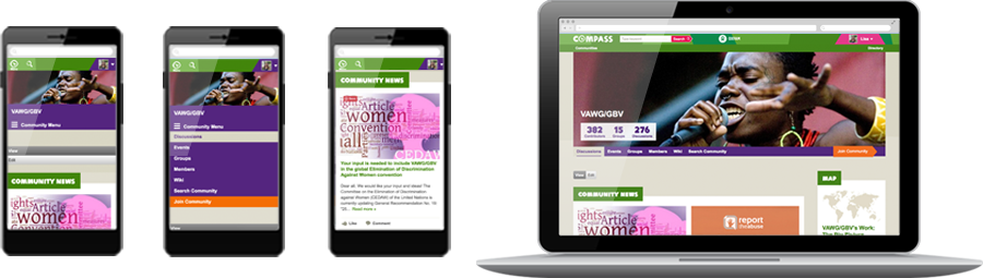
A Fully Responsive Design
To make features more accessible for users on mobile devices in countries with low bandwidth, we made this user interface fully responsive. The front-end developer went above and beyond my mock-ups to make this platform as responsive and mobile-friendly as possible.
The Development
An Integrated Team
The development team is a true collaboration between a consulting company and a client. It is comprised of project managers, designers, and developers from both the consulting agency and the client’s IT department which allows us to get changes and updates implemented on client’s systems while having another resource to work on development the new platform.
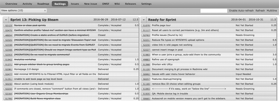
A Phased Approach
Dividing the “Big Picture” into smaller more manageable phases of work, allowed us to prioritize the development of specific sections of the site and features based on user needs, feedback, and business requirements. Each phase of work is divided into two week sprints that end with deployment to the live environment.
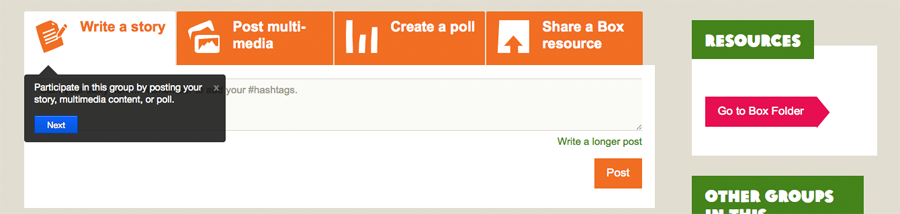
First-Time User Experience for Deploying New Features
With each deployment, we update the first-time user experience tour to call a user’s attention to new and updated features and functionality. For first-time users, they get a description of each type of page in the platform and a tour or each feature within that page.
The Refinement
Feedback and Iteration
With each phase of this project, the product manager and I conducted user acceptance testing (UAT) sessions, and walked users through the new features and improved functionality. Then, we provided them with a list of tasks to complete. Users worked their way through the tasks and provided us with their thoughts on the improvements and feedback based on their expectations.
We created bug tickets and additional user stories based on findings from the UAT session and added them into the backlog to be prioritized. The client’s product owners helped prioritize tickets for future builds and give clarification on the feedback often answering questions that build our empathy for the users.
Recent Portfolios
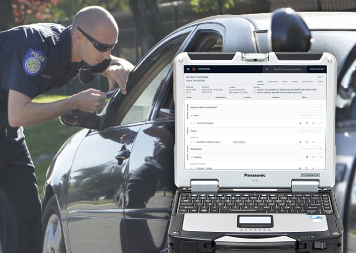
Quicker Report Writing and Review for Public Safety
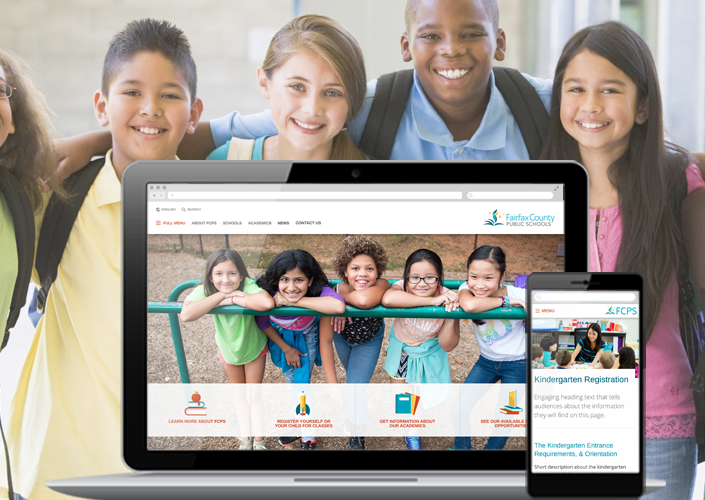
Integrated Websites for a Public School District
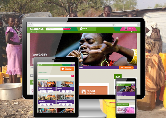
A Collaborative Workspace for an International Nonprofit