Enterprise Records System for Public Safety
Quicker Report Writing and Review for Public Safety
I led a dedicated cross-functional team to reimagine a quicker, easier report writing experience for officers and enhance the review process for supervisors and records clerks working at law enforcement agencies.
Lead User Experience Designer
As the lead designer on the records management product, I collaborated with a senior UI designer and an associate UX designer to define and design a new experience for writing and reviewing reports. We collaborated with a cross-functional team including a product manager, product owners, technical architects, and engineers to verify new concepts, consider the ramifications for the product, and prioritize features.
I conducted discovery interviews and shadowing sessions, documented findings, created personas, and defined user journeys and workflow as diagrams. I designed wireframes, gathered feedback, early and often, and iterated as needed. I collaborated with the UI designer designed on layouts and components needed for the design system. We created functional prototypes to use for conducting usability tests to validate the new designs and demoing the new user experience to internal and external stakeholders.
Halfway through the project, an associate UX designer joined our team. Both the UI designer and I mentored her as she learned the design process and became familiar with the product. I accompanied her to her first ride-along and shadowing sessions, and coached her as delve into her work — creating wireframes, collaborating with the UI designer on mockups and prototypes, conducting usability testing, and benchmarking the systems.
The Challenge
Reimagine a very complex, tightly coupled data entry and review process. Features and functionality for both processes displayed on the same screen at all times in the process making it hard for users to know what tasks needed to be completed at any point in the workflow.
The Vision
Separate the writing and editing experiences from the reading experience to give the users easy reading, scanning, and review process experiences on a report. Only display features needed depending on what step a user is in the data entry or review process.
The Impact
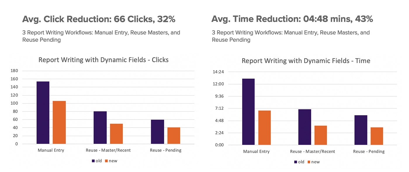
The new data entry designs created approximately a 43% reduction in the time it takes an officer to write a report in the field which gets the officer back on the streets of our communities faster.
Discovery
User Research Unlocks Hidden Issues
To better understand users and their challenging jobs, I spent time riding along with officers, and shadowing and interviewing records clerks, patrol supervisors, command staff, and IT administrators in law enforcement agencies.
Ride-Alongs and Shadowing Sessions
To say that a police officer has a demanding job is an understatement and it’s not possible to fully understand it riding shotgun either. However, riding with and shadowing them in the office gives me a better understanding of what their job entails and what they really need when writing a report — a quick and easy data entry experience and an easy way to fix mistakes during the review process.
In the office, supervisors and/or records clerks work through the review process. Supervisors concentrate on the situation and whether or not the report is complete, while records clerks tend to focus on grammar, correct code usage, and master record reuse.
After each session, I’d type up my notes and send out links to the cross-functional team for transparency. Once I had enough information to qualify ideas into themes, I’d bring together the team to talk through possible ideas and prioritization.
UX Design
Creating a Modern User Experience
It quickly became apparent that different personas used the report screen to complete different tasks and that the functionality needed to be separated by role and by workflow step.
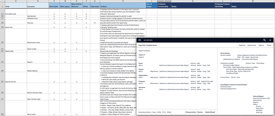
Reorganizing Functionality to Better Suit the Users
I analyzed the current system and listed the features and functionality available on the report screen. Then I grouped similar types of functionality together and thought about who uses that functionality and when in the data entry or review process that functionality is used. This analysis became the foundation for the wireframes.
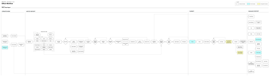
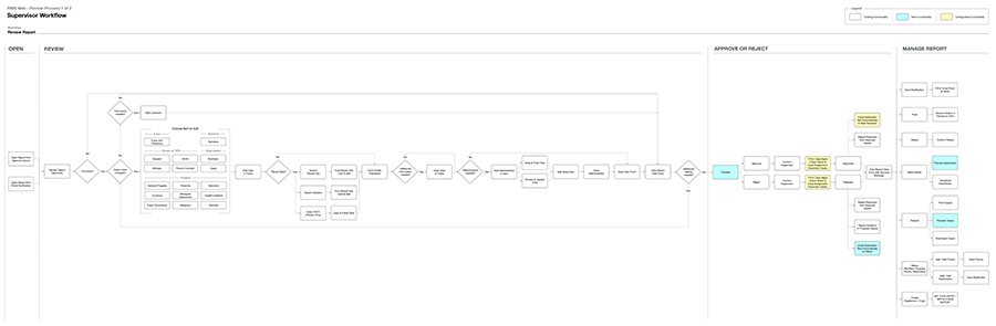
Documenting Complex Workflows
The report screen supports two distinct workflows for different roles. The patrol officers write the reports. The supervisors and records clerks work through the review process for the reports.
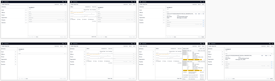
Lo-fi Wireframes with Purpose
To work through ideas quickly, I created lo-fi wireframes to show the UI designer. We talked through the wireframes, evaluated ideas, and iterated until the wireframes were in a place to move forward with more detailed wireframes and mockups.
UI Design
A Modern UI for a Contemporary User Experience
I collaborated with a UI designer, who was also working on the design system, to design screens for the records system.
A Modern UI
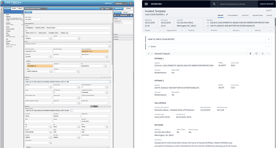
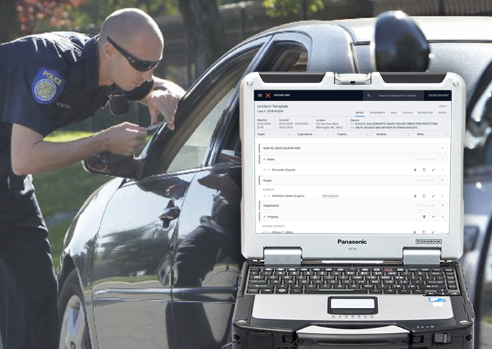
Creating a new UI included designing new layouts and components for the report writing and review process screens. Below is an example of a report that has gone through the review process and is available for users to scan and read in the system. (Image: Old UI — Left, New UI — Right)
The Kevlar Design System
While we redesigned the data entry and review process, the UI designer was also working on the Kevlar Design System. I worked with the UI designers to help document the design system — foundation elements, components, and voice and tone guides.
Validation
Backing up Design Decisions with Qualitative Data
There was an overwhelmingly positive reception for the new data entry and review process user experiences during stakeholder demos and usability testing.
Positive Numbers From Usability Testing
The most satisfying part of my job is seeing users actually use the products I design. It’s satisfying to see usability sessions go well and humbling when a design fails and needs more work.
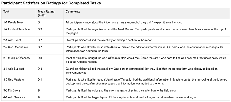
With each task, I ask users to quantify their experience on a scale of 1-10. These are the results from a round of usability testing. I actually received a hug during this round of testing. Ask me about it and I’ll show you the GIF from the usability session.
Benchmarking for the Win
At the beginning of this case study I stated, “The new data entry designs created approximately a 43% reduction in the time it takes an officer to write a report in the field which gets the officer back on the streets of our communities faster.” I wouldn’t make this statement without being able to back it up.
Benchmarking numbers help designers show the value of their designs. I benchmarked the number of clicks and time on task for a number of data entry and review process tasks in the current system and in the new designs. My numbers couldn’t be confirmed though.
The associate UX designer started and I gave her ownership of the benchmarking project. I had her setup a system just for the designer team so she could learn the system and have a clean system for benchmarking. She took my benchmarking to a new level and proved our designs were making a difference.
Recent Portfolios
Quicker Report Writing and Review for Public Safety
Integrated Websites for a Public School District
A Collaborative Workspace for an International Nonprofit